
Girlguiding, the iconic UK youth organization dedicated to empowering girls, has undergone its most significant rebrand in over a century. With a fresh identity designed by the renowned consultancy Landor & Fitch, Girlguiding is stepping into the future while staying true to its mission of inspiring girls to believe in their limitless potential.
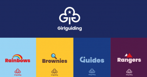
So, what’s new? Well, everything’s still recognizable, but with a twist! The classic trefoil logo remains, now sporting a sleek, modern vibe. Plus, there’s a clever addition – two hidden Gs in the design. From Rainbows to Rangers, each group has its own unique flair, with bold colors and snazzy icons that scream “girl power!”
The response to the rebrand has been overwhelmingly positive, with the bold designs and colors resonating with volunteers, parents, and children alike. As Bustin reflects, many of the team members involved in the project have personal ties to Girlguiding, making the rebrand a deeply meaningful endeavor.
While the new identity has already made its debut online, the full rollout will be gradual, with program materials and uniforms set to change in the coming years. In the meantime, Girlguiding is encouraging its members to explore the purpose and processes of rebranding through engaging activities, fostering a sense of ownership and pride in the organization’s evolution.
As Girlguiding continues to empower girls across the UK, its bold new look serves as a beacon of inspiration for generations to come. With creativity, inclusivity, and a commitment to progress, Girlguiding is proving that indeed, girls can do anything.